This article refers to theming in Drupal 7, which is very different to Drupal 8. Some links have been stripped from this article due to age and inaccessibility.
This is post 3 in a mini-series on Base themes.
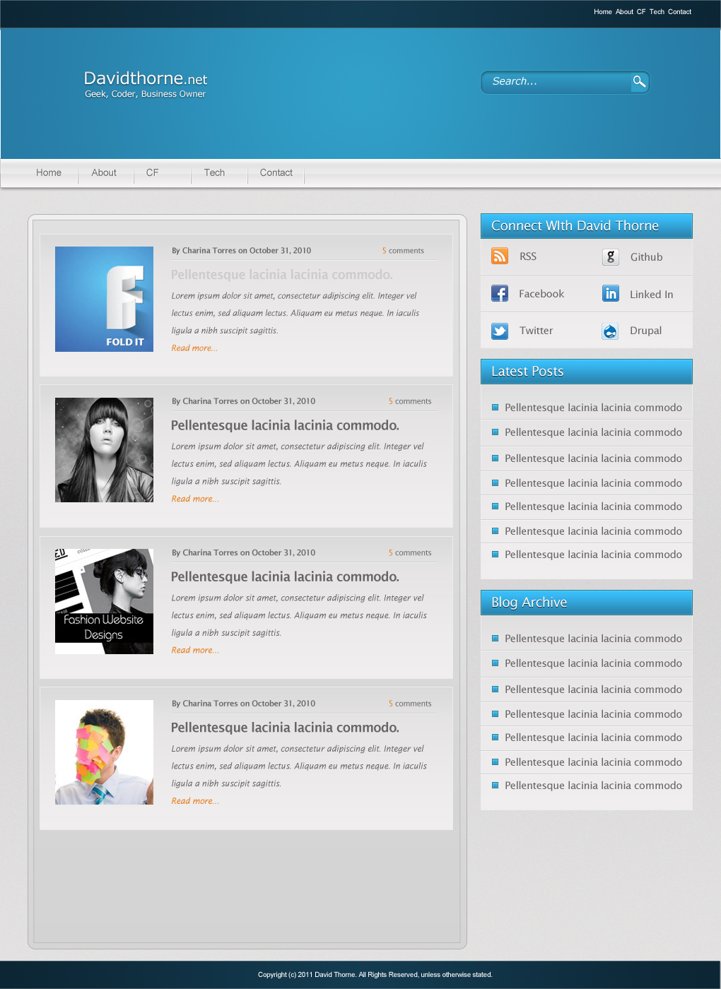
OK a number of things before I start. Most importantly, and sadly my talk didn’t get picked for DrupalCamp London. Whilst it’s a shame, I can at least concentrate on getting this mini series done, and resubmit the talk (Possibly with a look to how twig will help theming in Drupal 8) for a later camp in the year. Secondly, I have adjusted the review process to suit being more involved for future talks (I intend to work on getting my proposed session published). This post is designed to demonstrate my new (And fairer) review process. Finally, I am also aiming to publish my Omega review/talk this week too as I won’t get anything Theming miniseries based published over the 2nd/3rd March 2013 due to DrupalCamp. Trying to keep ahead of the game here! They are not necessarily going to be both published on Sunday (As is becoming my norm) but I will definitely have both articles posted by mid-week. I have decided the best way to actually test the themes is to install them on a dummy site (Similar to how I did at my Drupal Cambs talk back in November), and try and “theme” the basic layout of my new site design. For those who can’t remember what that looks like it will be attached to all the blog posts in this series. I am after the basic look and feel of the site rather than actual detail (E.G. I’m not going to bother theming the search box to match, but will the menus etc) and where possible (IE in themes that declare themselves as responsive) I will try to match at least 1 of my “smaller” resolution designs. The theme I enjoy working with the most will be the one I finish building for David Thorne.net and may very well also become my preferred base theme for the remainder of my time with Drupal 7. Drupal 8 has so many theming changes that I may well have to reevaluate what base themes I use, although I still plan to use them. Please note I am testing stable releases only. This means (for instance) I am not testing Omega 4.0 release, at time of writing in alpha 7 release [D.O]. Where grids are not included or are optional they will not be used. This is about raw theming and not about what add on’s exist. I am highly appreciated of things like ZenGrids and intend to use it more often (Unless the base theme has a grid system attached already) but not on this review. I will however use SASS where available (But not when it isn’t there by default) No base themes I am using use Less (Another CSS framework) by default so I will not be testing that either. The default desktop design (over 1200 pixels in a media query) is shown below:

OK so that is kind of more of a blog post preview page but it gives you a good idea as to what I am trying to achieve. The site will have dummy content generated and I intend to post an image gallery of screenshots. The code for each of the themes will be published on my github [github.com]. With all this in mind, lets get cracking on building and reviewing…